2021
UX / UI
Minimalism Museum
Description
Designing an adaptive website for visiting the museum of minimalism online.
— Selection and registration for an online tour;
— view the tour on the website;
— payment for excursions.
— Selection and registration for an online tour;
— view the tour on the website;
— payment for excursions.
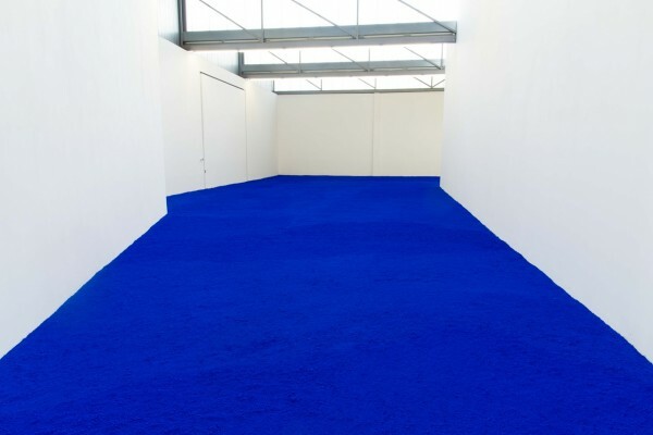
View of Pure Pigment installation, Venet Foundation, 2018
Yves Klein
Yves Klein
Task
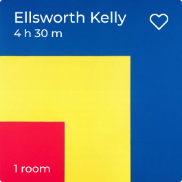
Red, yellow, blue — Ellsworth Kelly
The user must sign up for an online tour to view it on the website or any other device. After buying a ticket, a unique link to the online tour will be generated, with which the user can visit it.
What should be available to the user:
— Registration for an online excursion without registration and SMS;
— viewing the excursion from a computer or device;
— interaction with the guide and visitors.
— Registration for an online excursion without registration and SMS;
— viewing the excursion from a computer or device;
— interaction with the guide and visitors.
Research
Search and analysis took most of the project implementation time. With some of the museums and artists who were included in the research, you can see below.
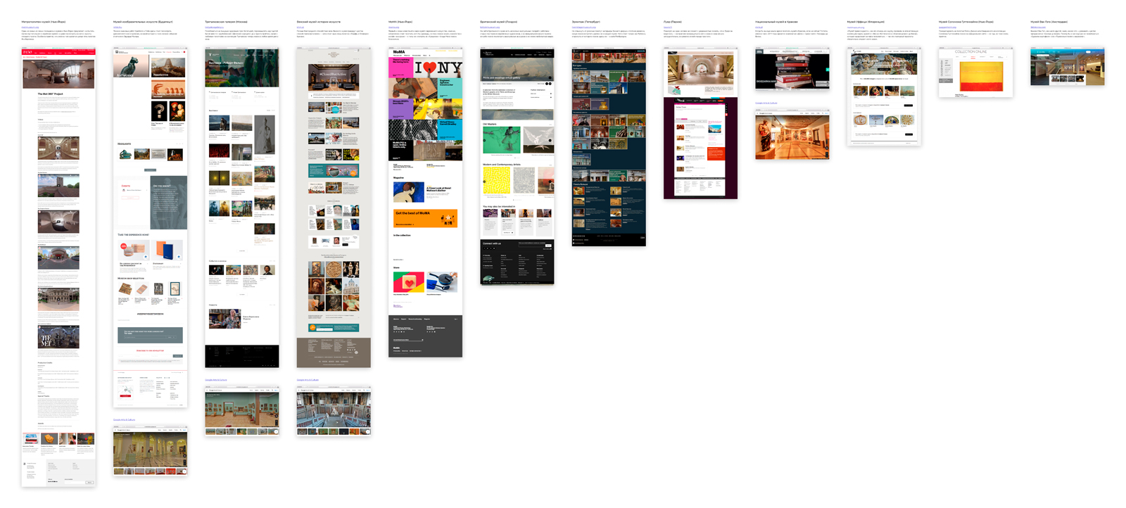
Museums
We have a huge number of museums in the art world, but among them there are those that almost every art lover knows. I highlighted 13 and did a detailed analysis of their UX

metmuseum.org
The Metropolitan Museum of Art of New York City, colloquially "the Met", bis the largest art museum in the United States. Its permanent collection contains over two million works, divided among 17 curatorial departments. The main building at 1000 Fifth Avenue, along the Museum Mile on the eastern edge of Central Park in Manhattan's Upper East Side, is by area one of the world's largest art galleries. A much smaller second location, The Cloisters at Fort Tryon Park in Upper Manhattan, contains an extensive collection of art, architecture, and artifacts from medieval Europe.

mfab.hu
The Museum of Fine Arts is a museum in Heroes' Square, Budapest, Hungary, facing the Palace of Art.
It was built by the plans of Albert Schickedanz and Fülöp Herzog in an eclectic-neoclassical style, between 1900 and 1906. The museum's collection is made up of international art (other than Hungarian), including all periods of European art, and comprises more than 100,000 pieces. The collection is made up of older additions such as those from Buda Castle, the Esterházy and Zichy estates, as well as donations from individual collectors. The Museum's collection is made up of six departments: Egyptian, Antique, Old sculpture gallery, Old master paintings gallery, Modern collection, Graphics collection. The institution celebrated its centenary in 2006.

tretyakovgallery.ru
The State Tretyakov Gallery is an art gallery in Moscow, Russia, the foremost depository of Russian fine art in the world. The gallery's history starts in 1856 when the Moscow merchant Pavel Mikhailovich Tretyakov acquired works by Russian artists of his day with the aim of creating a collection, which might later grow into a museum of national art.

khm.at
The Kunsthistorisches Museum is an art museum in Vienna, Austria. Housed in its festive palatial building on Ringstraße, it is crowned with an octagonal dome. The term Kunsthistorisches Museum applies to both the institution and the main building. It is the largest art museum in the country and one of the most important museums worldwide.

moma.org
The Museum of Modern Art (MoMA) is an art museum located in Midtown Manhattan, New York City, on 53rd Street between Fifth and Sixth Avenues.
It plays a major role in developing and collecting modern art, and is often identified as one of the largest and most influential museums of modern art in the world. MoMA's collection offers an overview of modern and contemporary art, including works of architecture and design, drawing, painting, sculpture, photography, prints, illustrated books and artist's books, film, and electronic media.

britishmuseum.org
The British Museum is a public institution dedicated to human history, art and culture located in the Bloomsbury area of London, England. Its permanent collection of some eight million works is among the largest and most comprehensive in existence, having been widely collected during the era of the British Empire. It documents the story of human culture from its beginnings to the present. It was the first public national museum in the world. The Museum was established in 1753, largely based on the collections of the Anglo-Irish physician and scientist Sir Hans Sloane. It first opened to the public in 1759, in Montagu House, on the site of the current building. Its expansion over the following 250 years was largely a result of expanding British colonisation and has resulted in the creation of several branch institutions, the first being the Natural History Museum in 1881.

hermitagemuseum.org
The State Hermitage Museum is a museum of art and culture in Saint Petersburg, Russia. The second-largest art museum in the world, it was founded in 1764 when Empress Catherine the Great acquired an impressive collection of paintings from the Berlin merchant Johann Ernst Gotzkowsky. The museum celebrates the anniversary of its founding each year on 7 December, Saint Catherine's Day. It has been open to the public since 1852.

louvre.fr
The Louvre, or the Louvre Museum, is the world's largest art museum and a historic monument in Paris, France, and is best known for being the home of the Mona Lisa. A central landmark of the city, it is located on the Right Bank of the Seine in the city's 1st arrondissement.

mnk.pl
The National Museum in Kraków, popularly abbreviated as MNK, established in 1879,is the biggest museum in Poland and is the main branch of Poland's National Museum, which has several independent branches with permanent collections around the country. The Museum consists of 21 departments which are divided by art period; 11 galleries, 2 libraries, and 12 conservation workshops. It holds some 780,000 art objects, spanning from classical archeology to modern art, with special focus on Polish painting.

uffizi.it
The Uffizi Gallery is a prominent art museum located adjacent to the Piazza della Signoria in the Historic Centre of Florence in the region of Tuscany, Italy. One of the most important Italian museums and the most visited, it is also one of the largest and best known in the world and holds a collection of priceless works, particularly from the period of the Italian Renaissance.

guggenheim.org
The Solomon R. Guggenheim Museum, often referred to as The Guggenheim, is an art museum located at 1071 Fifth Avenue on the corner of East 89th Street in the Upper East Side neighborhood of Manhattan, New York City. It is the permanent home of a continuously expanding collection of Impressionist, Post-Impressionist, early Modern, and contemporary art and also features special exhibitions throughout the year. The museum was established by the Solomon R. Guggenheim Foundation in 1939 as the Museum of Non-Objective Painting, under the guidance of its first director, Hilla von Rebay. It adopted its current name in 1952, three years after the death of its founder Solomon R. Guggenheim.

vangoghmuseum.nl
The Van Gogh Museum is a Dutch art museum dedicated to the works of Vincent van Gogh and his contemporaries in the Museum Square in Amsterdam South, close to the Stedelijk Museum, the Rijksmuseum, and the Concertgebouw. The museum opened on 2 June 1973, and its buildings were designed by Gerrit Rietveld and Kisho Kurokawa. The museum contains the largest collection of Van Gogh's paintings and drawings in the world.
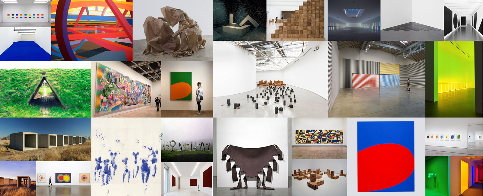
Artists
After analyzing minimalism, it was decided to take the main representatives of this direction. Paying tribute to the figures who have become classics.
User Flow
The most simple and understandable user flow with a minimalistic variability of the ways of user expirience.
Main Page
Events
Artist Page
Reserve Event
Payments
Stream
Account / Login
Settings
Streams
Tickets
History
Exhibitions
New Artists
Collections
Store
Wireframing
The default 12 column grid is used for desktop solutions. For smaller screens, specifically for the tablet version, it was decided to take 9 columns of the same size, which made it possible to use identical sizes of cards and interaction windows.
GRID SYSTEM • DESKTOP
≥1200 PX
GRID SYSTEM • TABLET
≥992 PX
GRID SYSTEM • MOBILE
<576 PX
UI kit
Below is some of the UI-kit, colors and typography.
UI KIT
COLOURS
HEX #1F19C2
R31 G25 B194
Yves Klein
White
R255 G255 B255
HEX #FFFFFF
Malevich
R0 G0 B0
HEX #000000
Dark Grey
R48 G48 B48
HEX #303030
Light Grey
R136 G136 B136
HEX #888888
Gainsborough
R176 G196 B222
HEX #b0c4de
Smoky White
R245 G245 B245
HEX #f5f5f5
Garnet
R243 G71 B35
HEX #f34723
Emerald
R80 G200 B120
HEX #50c878
UI KIT
TYPOGRAPHY
Solution
Minimalism in the solution was an important necessity. Reducing action has become a top priority. On the main screen, it was necessary to fit all the artists and reject other decisions, so in my concept there was a choice of any date and time.
SOLUTION
HOMEPAGE
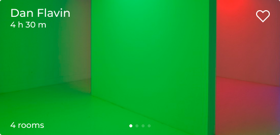
All available excursions are displayed on the main screen. There are 2 types of cards. X1 and X2. When the screen is reduced, they are rebuilt from 4 columns to 3. And all the cards are in one page on mobile phones.
Tablet
Desktop
Mobile
DESKTOP
HOMEPAGE
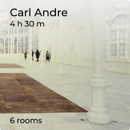
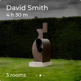
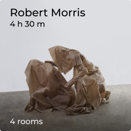
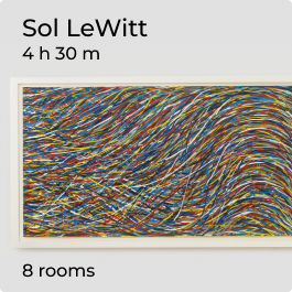
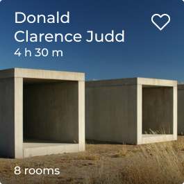
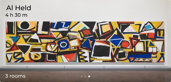
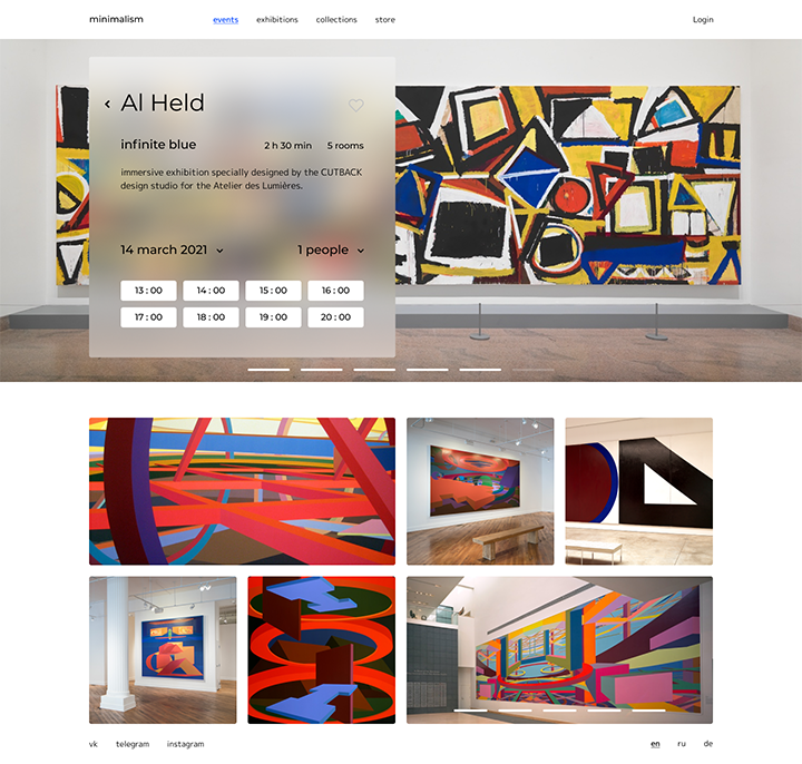
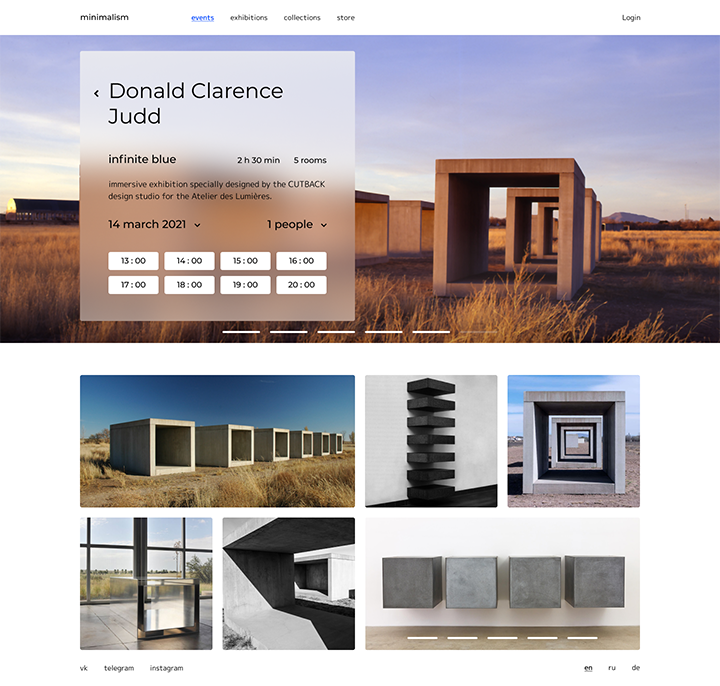
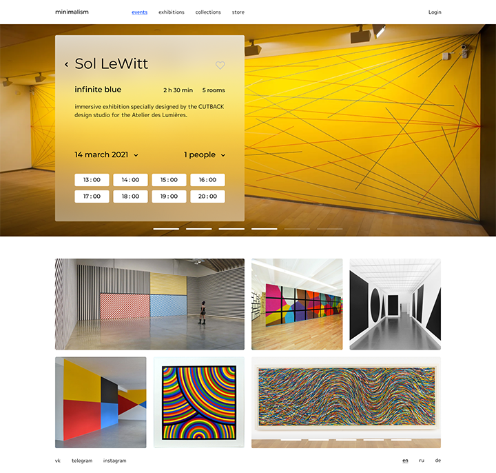
The card contains all the necessary information: the author's name and surname, time and number of rooms.
SOLUTION
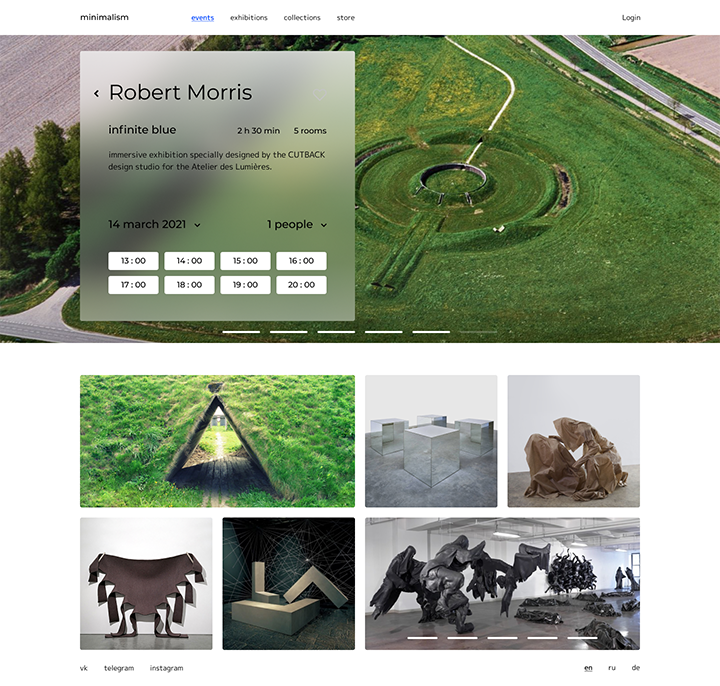
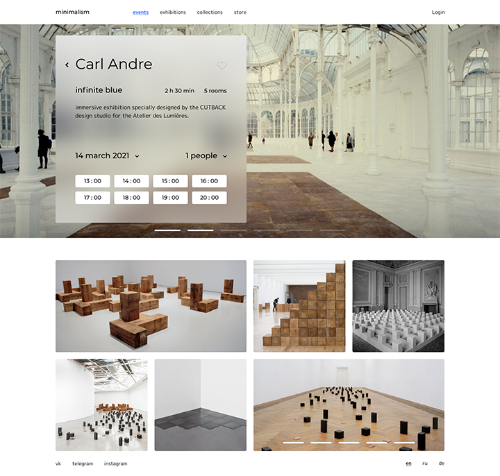
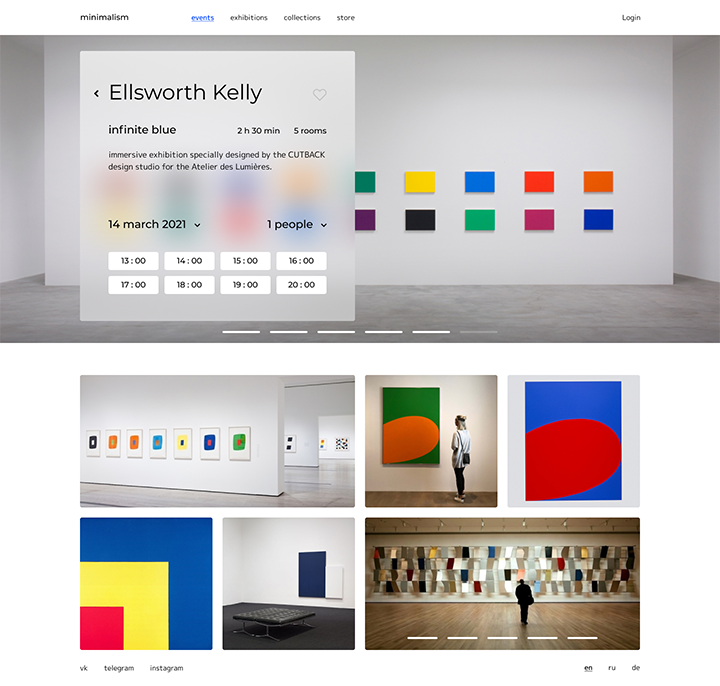
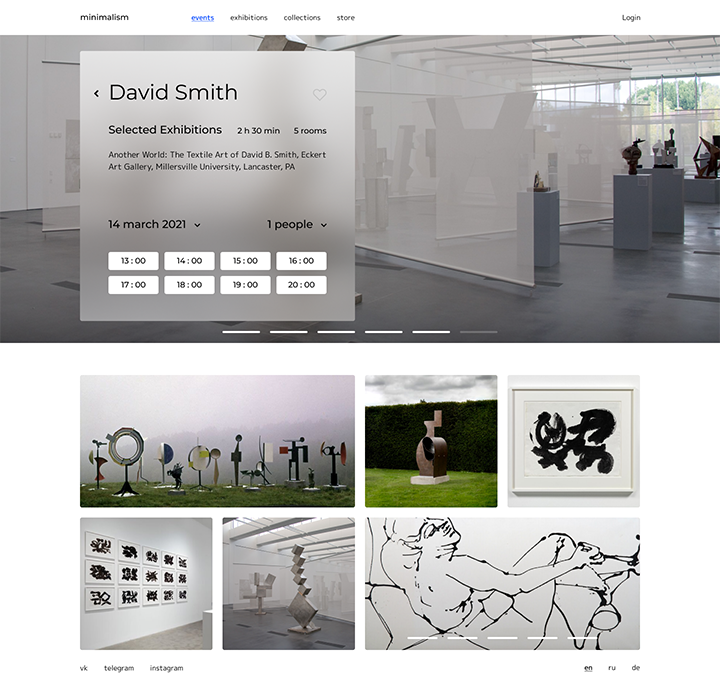
ARTIST PAGE
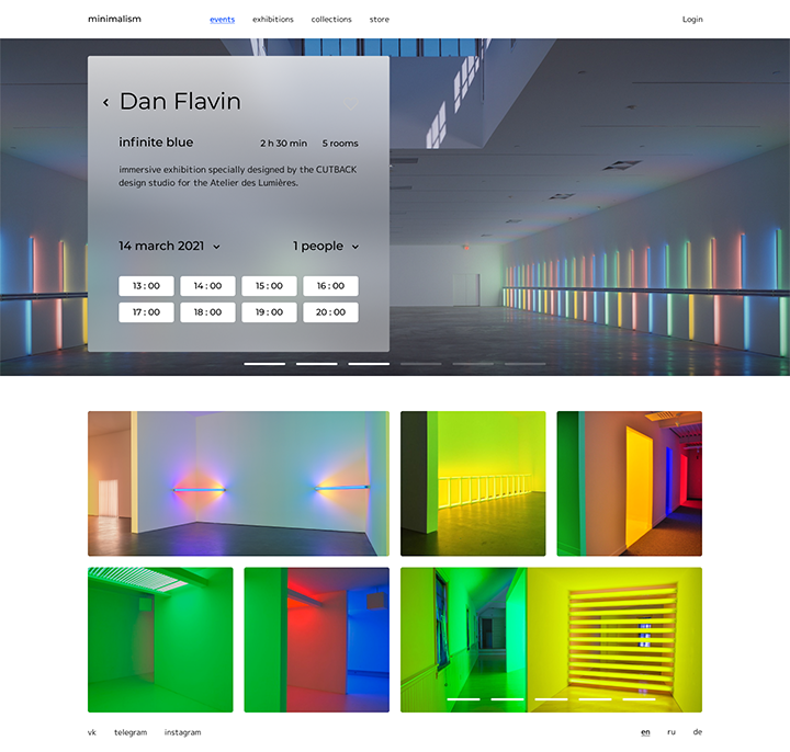
The page with the event has a slider and detailed information about the author and the halls. The slider has a single window with interaction.
Tablet
Mobile
Desktop
DESKTOP
ARTIST PAGE
The user sees the author's name with the option to navigate back to the main selection. In the interaction window, you can select the nearest date, visitors and start time of the event.
DESKTOP
ARTISTS ' PAGES
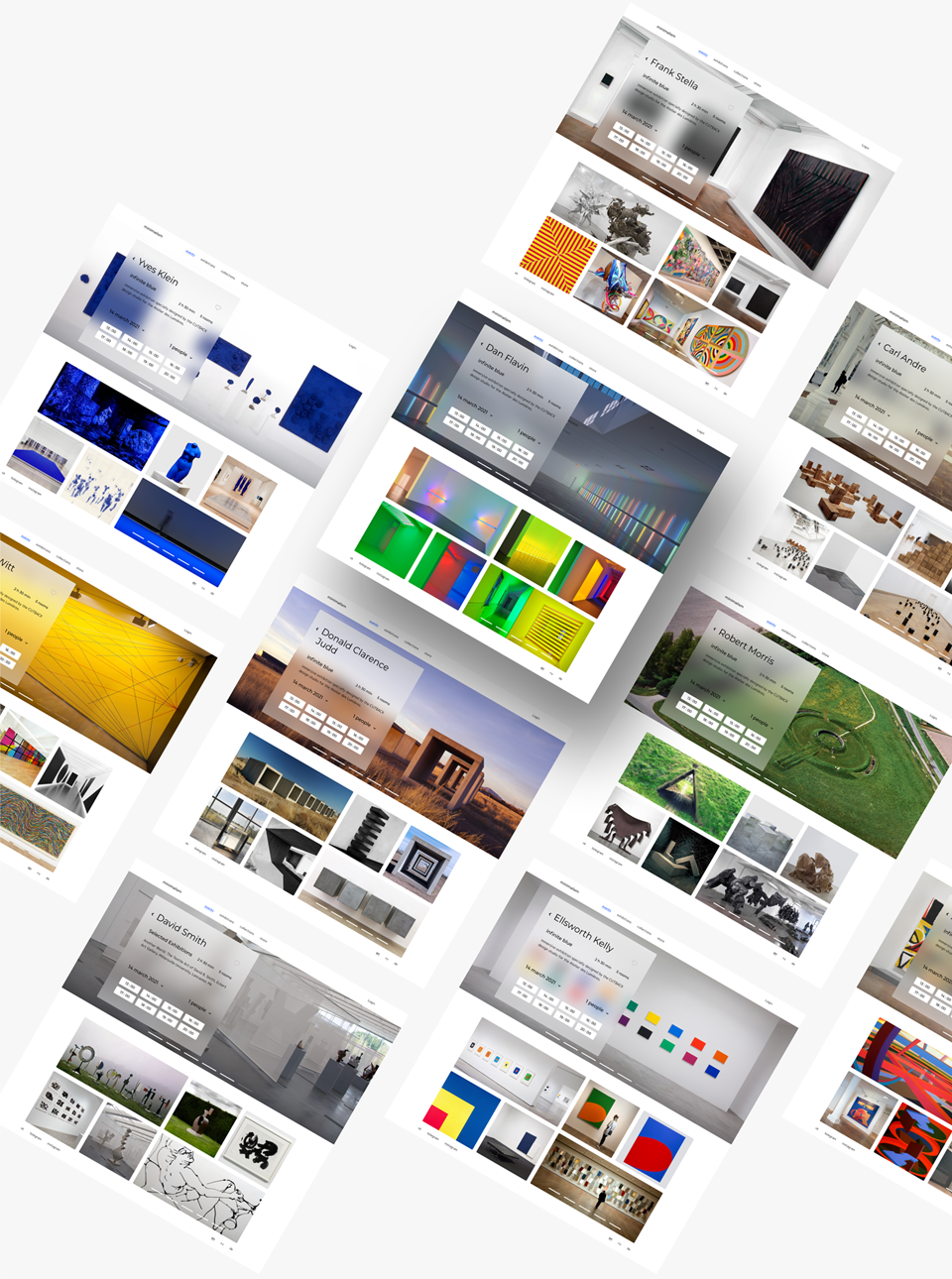
As an example, I took the main representatives of minimalism and designed their pages on the website of the minimalism museum.
DESKTOP & TABLET • DETAILS
INTERACTION WINDOW
the interaction window has 6 states. From choosing the time, setting up the event, payment and form — to the screen with the start button of the event (with a timer before the start)
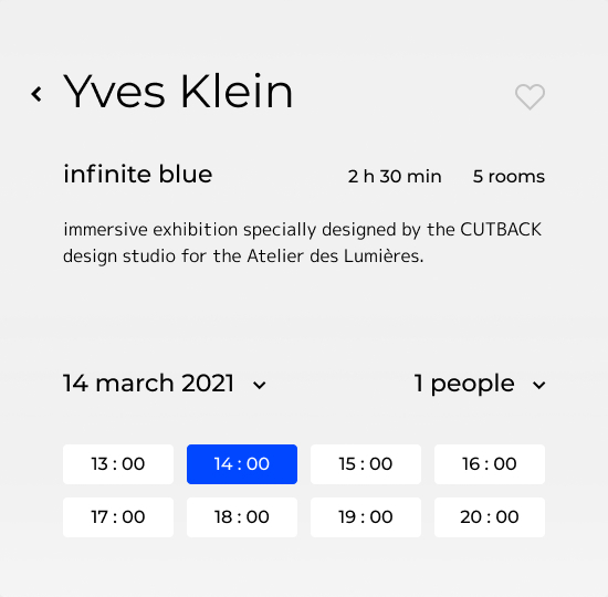
The start screen contains a selection of the date, visitors and the start time of the event.
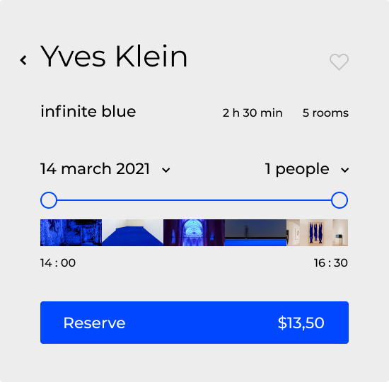
User gets to the screen with the event settings, where you can select the exhibition period.
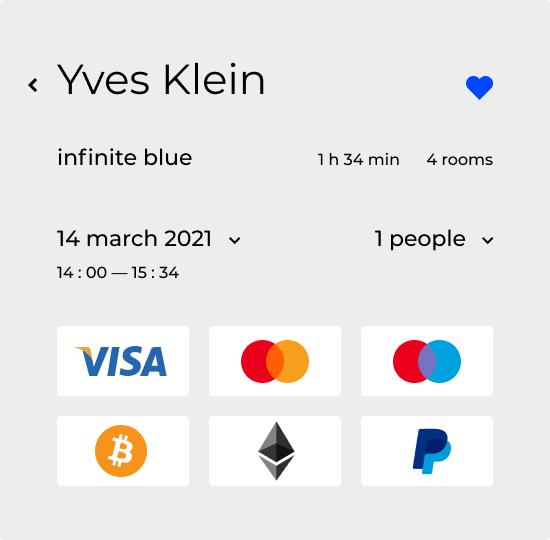
After clicking the reserve. The user gets to the first payment screen with a choice of methods.
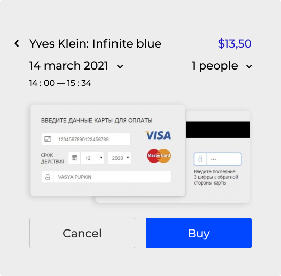
The second payment screen is the completion of the payment, depending on the previous selection.
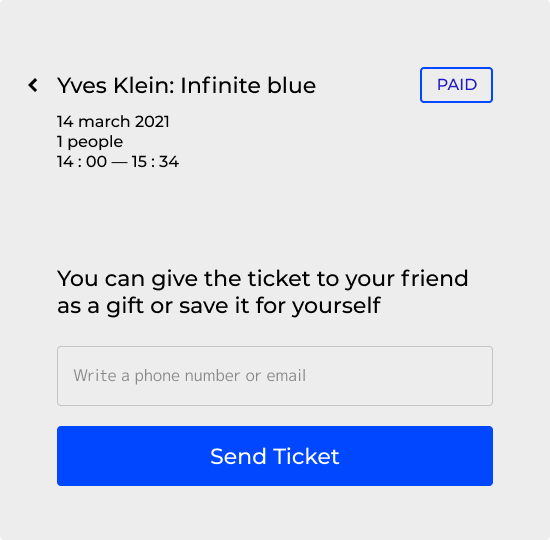
After payment, the user gets to the screen with a form for entering mail or phone number.
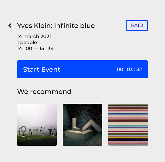
The interaction window becomes the entry point to the event and has a timer + recommend events.
SOLUTION
MAIL DESIGN
The letter contains the details of the event and call to action button with a timer. The email is very similar to the interaction window
DESKTOP
CARD VARIABLE
The cards on the main screen have 3 states. And serve as the input point of the stream.
Below are the states of the event cards with a description of their states.


00
00
:
:
00
start
The event card before the purchase of the visit.
A card after the purchase, with a timer before the event starts.
The card after the purchase, with the start button.
DESKTOP & MOBILE
EVENT TRANSLATION
It is a pity that the stream was not the main task, because this direction has great potential and it can become a good project in the future. At the moment, the raw version with a chat


